
Cherkizovo: Petelika brand revamped

Over the last ten years, “Petelinka” has been a standard for quality in the production of natural chicken. According to studies, customer loyalty to the brand over the past three years has remained at a steady 70%.
The aim of the rebranding was to strengthen the brand’s emotional appeal for consumers, to reinforce the quality of the products, and to ensure that the brand conforms to modern marketing trends. There were two main concerns when positioning the brand: product quality, and emotional interaction with the customer, based on the idea of caring and kindness.
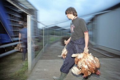
These priorities can be seen in the new advertising campaign. The image of a chicken held by caring hands has formed the basis of the new logo, which has also been created with warm colours. The brand’s slogan, “Tender chicken from caring hands,” highlights that creating favourable living conditions for the chickens, means that “Petelinka” cares for its customers.
The advertising campaign accompanying the rebranding includes outdoor advertising, advertising on the subway and in the press, as well as television adverts which feature live chickens for the first time. The packaging design has also undergone significant changes. The shape of the tray is now oval, a logo has been printed on its base, and the packaging film is now brightly coloured.
“Petelinka” holds a good position in the Moscow region and is one of the key brands in Cherkizovo Group’s portfolio. Given the development of the industry and the activities of Cherkizovo’s competitors, the brand needed to be updated and positioned more precisely.
Join 31,000+ subscribers
Subscribe to our newsletter to stay updated about all the need-to-know content in the poultry sector, three times a week.


 Beheer
 WP Admin
  Bewerk bericht